STRP x (IM)POSSIBLE BODIES
Visual Design - 2020
Role: Visual Designer, UX Researcher, Interaction Designer
Team: Anika Richards, Erin Teply, Alexis Lee, Chinmayee Kusnur PROJECT OVERVIEW
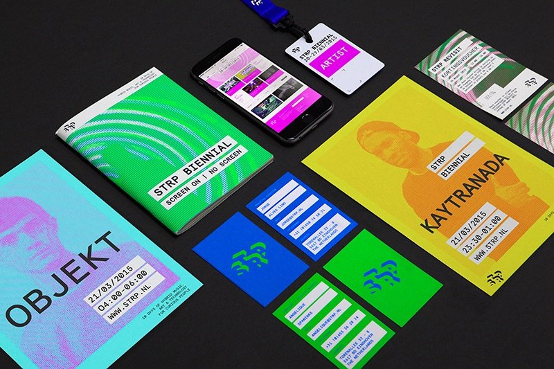
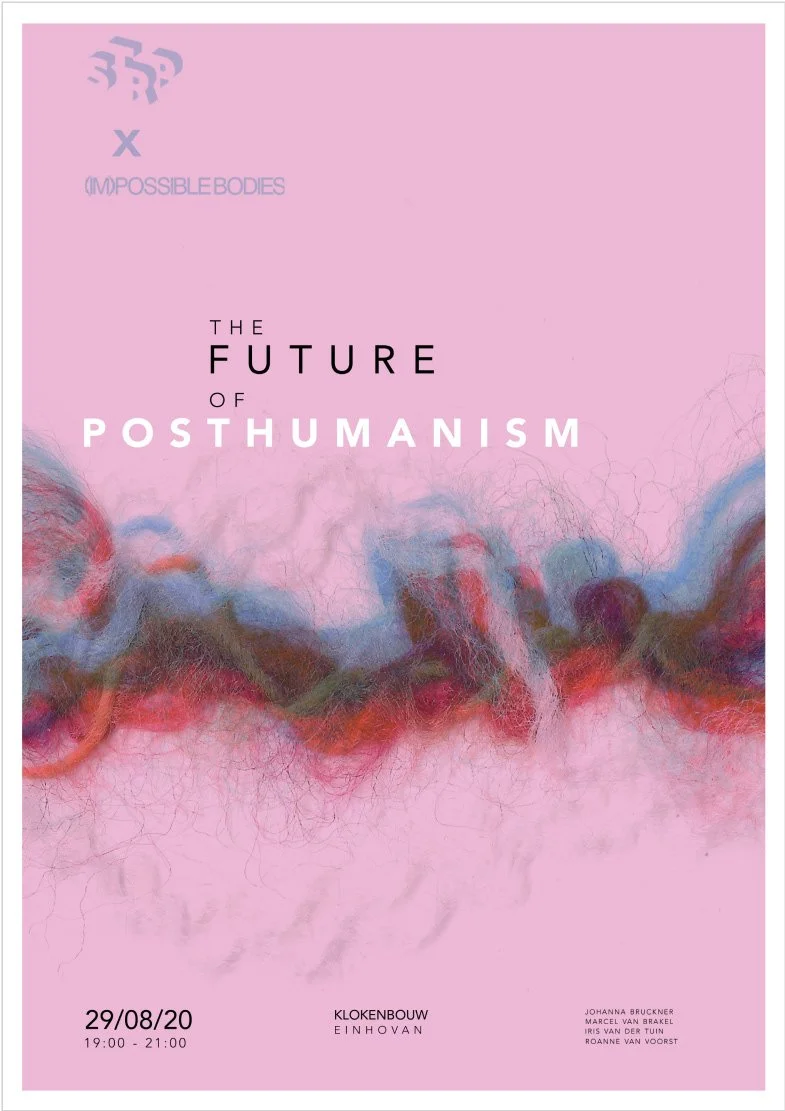
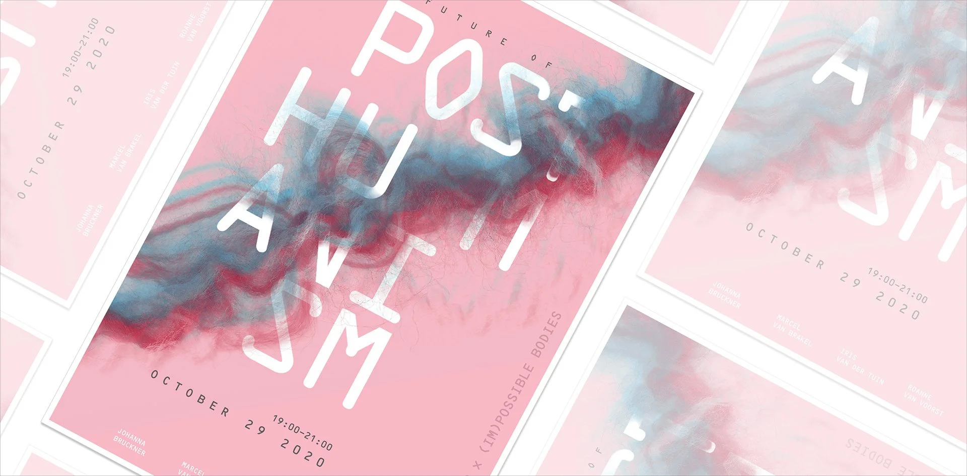
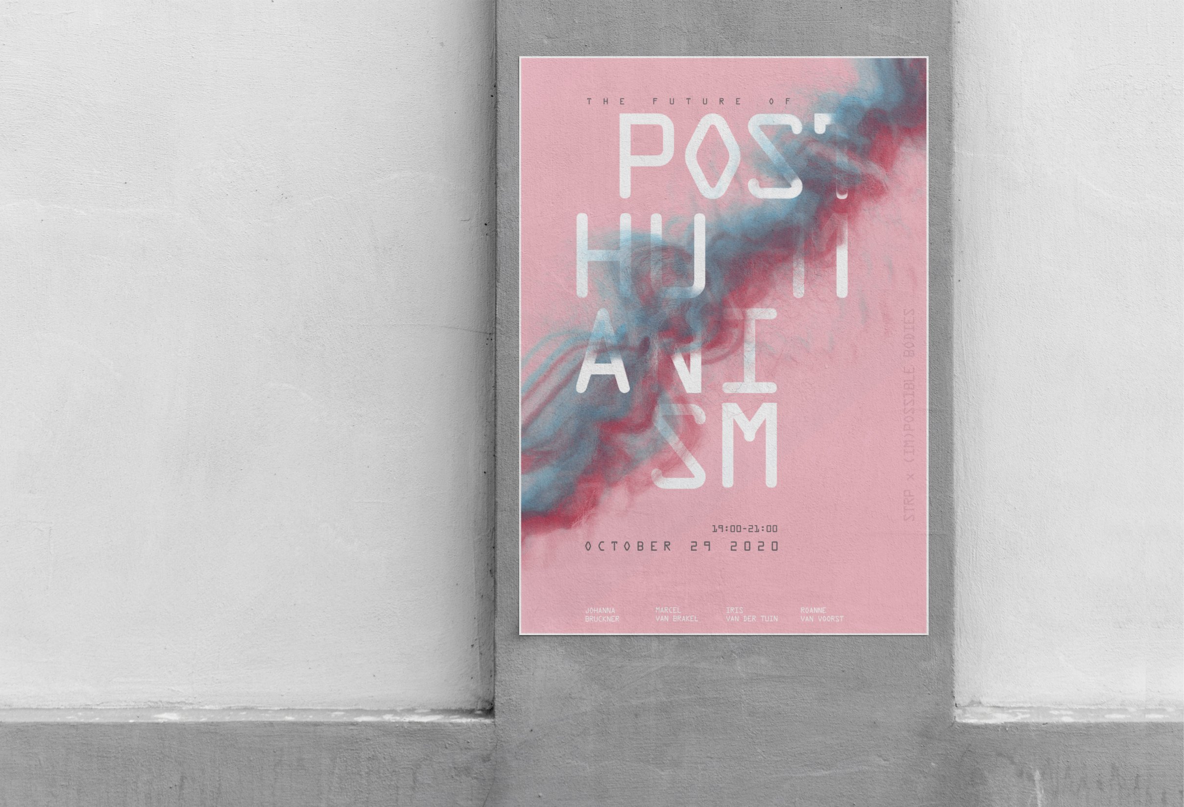
In my Information Design course, my team was tasked with creating visual branding for the event collaboration of STRP x (IM)POSSIBLE BODIES presents The Future of Posthumanism. As a lead visual designer, I was tasked with curating branding materials for the event, specifically, the main poster for advertisement that reflected Raw Colour’s principles, a multi-disciplinary design firm, and specifically drew from their STRP Identity created.
STRP branding identity InspirationEXPLORATION + EXPERIMENTATION
To begin I started our process by heavily focusing on research on STRP and the concept of Posthumanism. I began to understand how Posthumanism is focused on the emergence of artificial technologies in the realm of humans. Alongside that, I researched the design principles of STRP which proved their design identity to be simple yet representative of meaningful design choices as extracted from the works shown above. After establishing our framework, the idea of scanning and intertwining physical and organic yarn of two colours, red for humans and blue for machines, was explored.
Our experimentation and exploration phase utilized inspiration from Raw Colour as well as the following design principles:
FORM
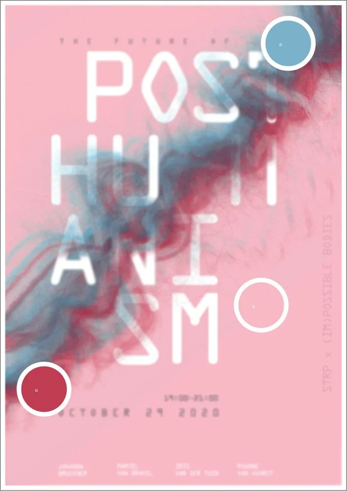
Using Photoshop's masking and various brush style tools, my goal was to manipulate the typography form by having the yarn run in between the word human to highlight the destructive nature of technology. In doing so, I simulated the feeling of letters being wrapped by the yarn. This was done to create an immersion of the organic and natural yarn combined with the meaning of posthumanism in order to exemplify the complexity of posthumanism. Also to further highlight the shift in the power dynamic from human to machine.
COLOUR
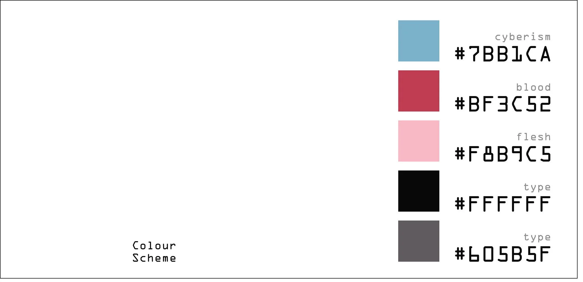
Following principles, our guiding colours for our art direction were derived from context-based information to create a cohesive piece such as cyberism, and the representation of humans through blood and flesh.
TYPE
The biggest challenge was finding a font that not only was fluid in form but heavily embodied the concept of Posthumanism. As someone who at the time lacked knowledge of typefaces, I sought support from our teaching team. Three sessions were required going through various font possibilities until the final session in which the typeface OCR A and OCR B were discovered.
This was the first font to be recognized by not only a computer but also by humans, furthering the goal to push the idea of Posthumanism beyond the norm and allowing for there to be a purpose behind the chosen font.
THE SOLUTION
After weeks of iteration, what resulted was a successful concept-driven project that allowed our team to push the overall design of the project. Through an iterative design process, we were able to extract the value of having concrete concepts which create a foundation and ultimately, drove the project to the end. This also further supported the creation of further branding materials such as tickets, event lanyards, and a initial microsite.
